
2.2. Plotting functions#
Visualization of functions help understanding the mathematical expression. Here we plot various functions using matplotlib package.
2.2.1. A Simple Plot#
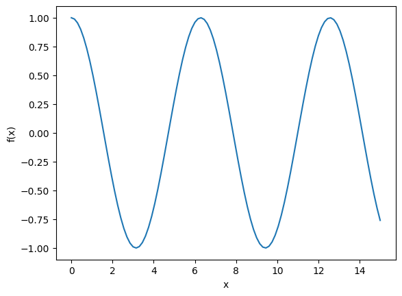
A simple way to plot a function is to express the function as an array First we generate points \(\{x_1, \cdots, x_N\}\) where the function is evaluated. Store the function as array \(\{f(x_i), \cdots, f(x_N)\}\). We utilize numpy module, linspace to generate grid points.
import numpy as np
import matplotlib.pyplot as plt

# generates 101 points between 0 and 15
x = np.linspace(0,15,101)

# evaluate the function at each point
f = np.cos(x)

# plot it using the default options.
plt.plot(x,f)
plt.xlabel("x")
plt.ylabel("f(x)")
Text(0, 0.5, 'f(x)')
2.2.2. Multiple plots#
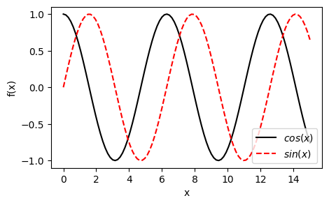
We can plot multiple curves in the same graph with different colors and types of lines.
# plot with various options

g = np.sin(x)

# set the canvas size
plt.figure(figsize=(5,3))

# black solid line with label
plt.plot(x,f,'-k',label=r"$cos(x)$")

# red dashed line with label
plt.plot(x,g,'--r',label=r"$sin(x)$")

plt.xlabel("x")
plt.ylabel("f(x)")

# show the labels as legend
plt.legend(loc=0)
<matplotlib.legend.Legend at 0x7efc611ac9d0>
Exercise: Plot \(f(x)=x \cos(x)\) and \(g(x) =x \sin(x)\) in the same graph, one with a blue solid line and the other with a green dashed line..
2.2.3. Multiple graphs#
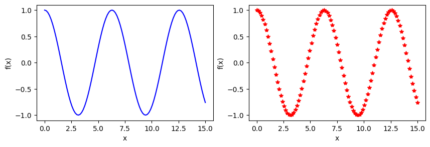
You can plot curves in two different graphs.
plt.ioff()
plt.figure(figsize=(10,3))

# plot in the left panel
plt.subplot(1,2,1)
# blue solid line with label
plt.plot(x,f,'-b',label=r"$cos(x)$")
plt.xlabel("x")
plt.ylabel("f(x)")

plt.subplot(1,2,2)
plt.plot(x,f,'*r',label=r"$sin(x)$")
plt.xlabel("x")
plt.ylabel("f(x)")

plt.show()
Exercise: Plot \(\cosh(x)\) and \(\sinh(x)\) in two different graphs side by side.
2.2.4. Ploting special functions#
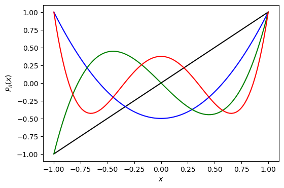
The last example plots Legendre polynomial of order 1-4.
import numpy as np
from scipy.special import legendre
import matplotlib.pyplot as plt

# define the legendre functions using scipy
l1=legendre(1)
l2=legendre(2)
l3=legendre(3)
l4=legendre(4)

#Legendre function is defined in |x|<1
x = np.linspace(-1,1,101)

# evaluate the functions
y1= l1(x)
y2= l2(x)
y3= l3(x)
y4= l4(x)

# plot all of them in the same graph with different colors
plt.figure(figsize=(6,4))
plt.plot(x,y1,'-k',label="n=1")
plt.plot(x,y2,'-b',label="n=2")
plt.plot(x,y3,'-g',label="n=3")
plt.plot(x,y4,'-r',label="n=4")

# axis labels are written as Latex equation
plt.xlabel(r"$x$")
plt.ylabel(r"$P_n(x)$")

plt.show()
Exercise: Plot Hermite polynomials of order \(n=1,\cdots, 4\) for interval \(x = [-5,5]\).